A fun endeavour, I created over 50 Custom filters created for Chatspin, a live video chat app for strangers to connect. I also created PR Images and promotional material.
Try Chatspin here!
Completed as a successful design challenge, I was asked to design an app that lets travelers see lowest currency conversion rates available within certain proximity to the user.
The UX flow is simple, allowing travelers to get in and out of the app. It works offline, boasts a friendly interface, and a tip calculator.
This was a solo project with all work completed by yours truly.
All custom iconography created to help tell the story of Yulio VR. Made with Illustrator.
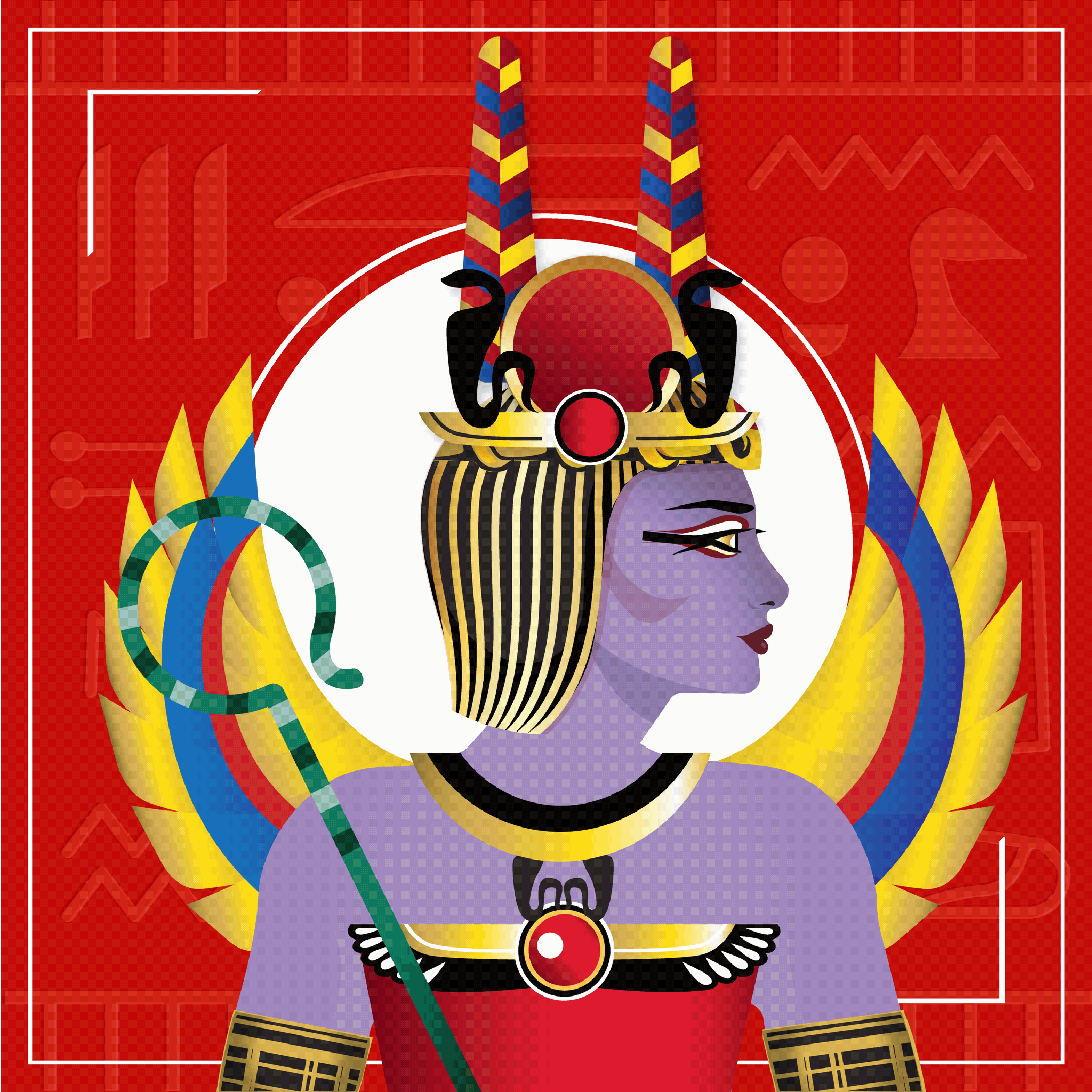
I’m the proud artist behind Crypto Pharaohs!
////
Press for Crypto Pharaohs:
https://apnews.com/press-release/newswire/entertainment-technology-travel-new-york-city-83d66ac29d4837250553bddb18881753
https://cryptonews.com/news/meta-pharaohs-nft-project-look-out-for.htm
https://www.flowverse.co/applications/crypto-pharaohs
https://www.globenewswire.com/news-release/2022/02/01/2376900/0/en/NFT-Project-Crypto-Pharaohs-to-Build-First-Wonder-in-the-Metaverse.html
Onboarding illustrations for Helbiz, a growing European tech startup, inspired by Malika Favre’s aesthetic.
You can see these illustrations live and in action when downloading the Helbiz app for both Android and iOS.
Created with Illustrator and animated with After Effects.
As Art Director of Pixel Tours, I was responsible for the rebrand of Yulio, one of our partner clients. This included the creation of a multipurpose logo design, video storyboarding and direction, copywriting, custom branded VR cardboards, business cards, trade show booth, flyers, whitepaper, and the home page design of the new website.
See yulio.com for more info.
I think drawing is a useful skill applicable to many areas and practices. For this reason, I draw regularly, even if it's just a sketch or documentary drawing. The illustrations featured here are only a few of hundreds 8)
Please contact me if you have requests. Click here If you would like to purchase prints or originals.
Mediums
Multimedia, Pen, Pencil, Watercolour, Illustrator
1st Place Winners of the 2019 Stantec / Globe and Mail Idea Hackathon in Toronto
We were prompted with the following question: How can we use technology to ensure Toronto is a thriving, livable, and resilient city for all?
My Role: Team lead, UX researcher, visual designer, pitch presenter
A collection of multi-use logos I've created for clients and competitions. 100% client satisfaction.
IVX Health, headquartered in California, has a national footprint of infusion centers care for patients with complex chronic conditions.
I was commissioned to help them reflect the personalized and friendly care they already provide across their branding materials — specifically, with warm illustrations.
They asked to provide diversity while making all characters feel relatable and genuine, and also to emit a positive care experience.
The client was very satisfied and is currently rolling out the illustrations across print and web materials.
https://www.ivxhealth.com
The Project
I was hired by Figurosity, an incredible online figure drawing tool for artists, to drastically improve the UX, UI, and visual design of the entire web/mobile platform and brand. I was also consulted on product, positioning, and pricing decisions.
My Role
- UX Research
- UX/UI Design
- Branding & Positioning
- Product Design
The Project
I was hired as the Lead UX/UI and Product Designer at OpenScreenplay (OS).
While directly managing a team of 5 designers and working with a full dev team based in Palestine, together we were able to bring to life the world’s first platform and community where storytellers and screenwriters can learn, build a profile, write individually or collaborate, and get paid and produced.
My Roles
- UX Research
- UX/UI Design
- Branding & Positioning
- Product Design
- Creative Lead
I was hired by Lindsy Berman to create a brand for her wholistic wellness business. After some deliberation, “SoulsticeHealth” was born!
Team:
Melissa Morgan - Creative Director, Photographer, Brand Strategist, Lead Designer, Copywriter
Rachel Xu - Illustrator, Visual Designer, Web Designer, Photo Editor, Social Media Designer
Adobe Tools
Adobe Premiere Pro
After Effects® CC
Audition®
Photoshop + Illustrator
& FinalCut Pro X
View the Comparative Before and After Version on my Colleague's Account:
https://www.behance.net/gallery/24940523/Compass-(Before-After)-Design-Comparisons
Background - Compass is a study about youth behaviour that works directly with high schools to implement positive changes in health policies and programs. Participating schools receive a customized report that includes evidence-based recommendations/feedback for policy and program improvement. These reports are presented to parents, teachers, and potential investors.
The Challenge - Although Compass’ existing report focuses on serious areas such as underage drinking, marijuana use, tobacco use, and bullying, the child-like illustrations and lack of prevalent data organization heavily detract from the study’s significance. It does not appeal to its main audience consisting of professionals. The overuse of colours fight the text for attention and leads to poor visualization. This further trivializes the message Compass wants to convey: that youth need YOUR help.
The Task - My group was tasked with redesigning this report; specifically the main template that would be customized by Compass employees for individual high schools.
Ideation and Development - We focused on enhancing the precedence of information, data visualization, professional branding, continuity, and simplicity. “Info boxes” were used to showcase the data. These squares simultaneously allowed for continuity and versatility without the sacrifice of clarity. Fonts were enlarged and shown against white or light grey backgrounds for easy readability. Large images were utilized to keep the design current and relevant while further enhancing the document’s overall appearance. Photos were edited to be black and white and faces of youth were not shown in order to maintain focus on the data.
Limitations - My team and I could not explore the full extent of our design creativity. The reason? Since we were to create a template that would require constant edits by a Compass designer who was not familiar our software, we had to keep things simple. Time and money is a factor when customization for each school is necessary, so we did not represent data by way of info graphics, charts, graphs, or similar variations that might be tedious to alter. We needed to facilitate this process of changing statistics to create a seamless, simple, user-friendly experience for our client. We also had a difficult time finding royalty free, cost-free stock photos. With no budget, our team needed to find both royalty free and cost free images for use in the report. This was especially difficult because we did not want to show faces in any of the images and the content of the report itself required specific imagery.
My Role - I was the Lead Designer of this project. I derived the initial concept and design elements, created branding guidelines, implemented all revisions, found and edited the stock photos, and fully designed 26 of the 28 pages, including the front and back covers. I also pitched the concept and design to the client who loved the initial look — but because I was not satisfied, I took it upon myself to go above and beyond and redesign the document to look even better. There is always room for improvement!
The Outcome - I am proud to say the client loved the design of the new brochures and had nothing but positive feedback to provide us with. Not only will they be using this design for their existing work, but they have also decided to present it to the federal government as part of their pitch/presentation. My team and I are honoured!
I was hired to co-create a popcorn brand for American children. Each character has their own backstory and personality, and will eventually correspond with its own popcorn flavour.
I created the 10 animals and the popcorn bag you see here using adobe illustrator. The kernels and ingredients were hand drawn on my iPad with Procreate.
Super fun project!
View entire publication here
The Client
University of Waterloo Chemical Engineering Department
The Context
The University of Waterloo's Chemical Engineering Department wanted to create an annual newsletter publication for their alumni.
My Role:
I managed and oversaw this from beginning to end.
- I co-ordinated the competition of the project name selection
- photographed all professors
- Edited all articles
- Wrote majority of articles in the piece
- Overall design, look and feel
- Assisted with video production and shot content
I was contracted to create a product concept pitch including 5 key screens for a revolutionary e-learning platform.
The Game
Enter the frightened dreamscape of a small child whose grandmother “Nona” bombards them with food. It’s up to YOU to protect their diets by ensuring they eat the healthy foods and avoid the ‘bad’ foods according to their dietary restrictions.
The Context
University project in which we created our first ever game and launched it on the marketplace. Created in collaboration with Gabriel Patti and Andrea Zehr. Final grade of 95%.
My Role
Character development and design (all views), mockups, coding, logo
The Context
I worked for a UX Design firm in Summer 2015. Their biggest client is a Start-up called "Zoom&Go", formerly known as "Zoomandgo.com" prior to my work there. The company facilitates the process of hotel bookings for the B2B world. My job was to entirely recreate the company's brand.
My Role
I was trusted with nearly full liberties for this company. I was in charge of the new logo, colours, style guide, business cards, powerpoint and pitch decks, articulation of the mission statement, web design (web and mobile), copywriting for all major marketing material, and banner design. I even tried my hand as a colour consultant and interior designer for the new office space.
Custom icons were created for the category features in Adam, a volunteering mobile app where neighbors help neighbors.
I was hired to create the 15 primary icons of the app which were used as cover images for categories and on various advertising materials, including TTC bus and billboard ads.
These icons needed to work well on various colored backgrounds, when scaled up to poster size for marketing purposes and on small phone screens. As such, I opted for a tricolor palette with simple shapes and friendly curves.
The Context
I was hired as a contract Art Director by Yield Advertising to think up campaign ideas for Giant Tiger's three new women's fashion lines. We were in competition with another agency for the account and had two weeks to prepare.
Our Mission
Create an empowering campaign idea that our client's customer could wholeheartedly relate to. Make a campaign that was scalable for future initiatives.
My Role
Working as a contract Art Director with Yield advertising, I was on a mission to craft a pitch winning campaign idea.
The Creative Director and I worked closely, coming up with several concepts, ruthlessly perfecting two which we took to the CEO of the agency for consideration.
Our winning idea was "Inner Voice". A woman's inner voice is authentic, trusted and gives her permission to do the things that are important to her.
My contract ended prior to the pitch competition for the Giant Tiger account, but needless to say I was beaming when I caught one of the commercials while watching TV a few weeks later :)
Globe and Mail talks about the campaign here
Get Ad News' perspective here
I worked with several team members and former clients to create branding, website, and in clinic experience elements for FieldTrip Health Toronto.
In August 2015, I was hired as a subcontractor under Bluenotion Inc to work on the refinement of the new Rogers Bank website. The primary branding elements were provided, and it was my responsibility to find/edit stock images and create a Usability Mood Board and High Fidelity mockups.
The site is now live at www.rogersbank.com/en/
While not my primary focus, I dabble in the expressive world of painting. I work with acrylics, oils, watercolours, and digital media. I've been commissioned for digital work and am currently selling prints of my watercolours. Please contact me for inquiries.
Representation
The “M” can be transformed into something greater than itself, (ie patterns, flowers, abstract art) with the variations of the logo representing versatility. The sharp edges are reflective of clean, crisp design and the strong angles indicative of boldness. The bright colours on a plain background show attention grabbing design, implying that I add colour to an otherwise blank canvas (without being overbearing).
Considerations
I created several variations as demonstrated in my mockups. Circular black and white versions can be used for social media confines whereas colourful floral patterns made with repetition can be used for product CDs.
Result
The continuity and universality used within this branding concept finds an ideal balance between multidimensional bold, fresh ideas, and amiable friendliness — what my customers experience when working with me.
Design Fiction project created in partnership with D2L. Primary focus on UX and UI.
View our interactive prototype here.
Team: Melissa Morgan | Taylor Cooney | Lily Jiang | Cody Poultney | Vib Soundrarajah | Drake Dereniowski | Gabriel Patti | Wesley Bush | Stewie Todd | Casey Alexander | ShengHao Liu
Context
The University of Waterloo Engineering Department hired me to create a simple but effective informational website for an annual event being hosted by several top tier Canadian Universities.
My Role
Front end design around the photographs provided.
Brand Identity for the legendary Marcie Jastrow’s new AR/VR, Film, & Media Production company.
Context: This University project was created in collaboration with Gabriel Patti. The task was to simply create a website, instead we decided to develop the concept of a company.
My role: I co-designed the look and feel, mockups, branding, marketing material, and web pages themselves.
Purpose: To provide the ultimate global fashion platform where people can imagine, create and realize their ideal selves.
What is it? Koral combines the convenience of the internet, benefits of an in-store fitting room and the perks having a personal stylist into one easy to navigate app. Users create an avatar with their own features and dimensions, allowing them to virtually ‘wear’ and securely purchase items from Koral’s huge fashion database consisting of several popular labels.
Functionality: Users create a realistic avatar based on their measurements, skin-tone, age, and height with an option to either upload a headshot or select a model that most resembles them. Completing a short questionnaire along with the use of HTTP cookies give Koral the ability to make customized style suggestions and provide updates based on preferences while simultaneously collecting user data.
Technology: Koral technology allows users to virtually ‘try-on’ clothing and accessories from various labels. A series of algorithms will allow clothing to stretch and shrink accordingly based on their avatar’s body measurements. This creates a realistic fit. Payment and shipping information only needs to be entered once per account. All transactions are secure and occur in-app. By entering the brand name and SKU number of a clothing item, Koral will search for matches from our supported retailers. If successful, the item will be available on the user’s account for mixing and matching.
Features: Koral synergizes four key concepts: massive selection of well-organized inventory, innovative avatar creation, comprehensible e-commerce tactics, and benefits of a personal stylist. The app is a connectivity hub for both fashion retailers and customers with no direct competitors.
Target Audience: Koral primarily caters to males and females age 15-30.
Cost: Free. Revenue is generated from the app’s B2B model in two ways:
1) Commission from online and in-store transactions; Koral gives users are a reference number 2) Real-estate and paid advertisements known as as ‘features’ on the app
Future Updates: Fashion is always evolving. Koral’s participating partners will be able to update their store’s own collections by using a company login ID. This open accessibility model eliminates the need for consistent manual maintenance and updating.
Experimental project created in partnership with D2L.
Team:
Melissa Morgan | Andrea Zehr | Jason Cho Emma Richter-Ryan | Josh Cobaschi Matthew Ramos | Hamzah Amin